Extracurricular Activities
There are no major announcements in this post, so if you're pressed for time, go ahead do something else. Really, there's nothing important in this post. =)
I have several websites I run. The vast majority of my time and energy goes into Atlas Quest, but occasionally I like to stray. There's the Ryan's a Total Goober website, which is essentially a vanity website to talk about myself. And there's The Soda Can Stove website, which I created because I was mad at a website for banning me when I tried to educate the folks on the finer points of alcohol stoves. Alas, the owners of that website did not appreciate my helpful comments because, well, they sold stoves, and they didn't make as much money when I encourage people to make their own. =)
And lately, I've been spending a lot of time working on the soda can stove website--a long neglected site that needed some loving. =)
What I want to talk about in this post, however, is how my work on a soda can stove website has affected AQ, because it has. =) I didn't predict or expect this to happen, and it's not exactly a huge, mind-boggling change. Many of you probably haven't even noticed the changes--but I think it's kind of interesting that anything I could do for the soda can website would have any impact at all on Atlas Quest.
And it started with my wish that the website didn't look like something thrown together by a high school student the night before an assignment was due. =) I wanted it to look professional and classy. Haha, yeah, laugh all you want, but I wanted people who read this site to think, "This person knows what they're talking about." And the presentation is just as important as the actual content.
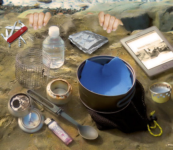
And come on, aren't my fingers clawing back up the cliff hilarious? I thought so!
Then I decided I needed a logo, and I kicked around some ideas. The title of that page, "The Soda Can Stove," had a neat font with lots of loops and character, but still, it's a font--nothing to get excited about. I wondered if there was some way I could spice it up a bit--somehow incorporate an actual soda can stove into the title. In fact, I thought, from a bird's eye view, the stove looks kind of like an 'O'. Even the simmer ring looked like an 'O'--and there are two Os in "The Soda Can Stove".
So I photoshopped some images into the title and liked the results. But it still needed more... those were pretty subtle changes. I needed more color! More character! I wondered if I could somehow incorporate an actual soda can into the logo. Perhaps as an L--especially a lowercase one, but there weren't any L's. Hmm....
Eventually, I incorporated a Pepsi can into the T and the scripted C from a Coke can into the logo, and it looked smashing!
Then I found myself looking at the new and improved page for How to Build a Soda Can Stove, and it looked great! Except.... now those subtitles delineating each step in the build process looked absolutely horrible. Funny, but I never really noticed that before.
It's kind of like when you buy a new vase for a living room. But then the vase doesn't really go with the table its own, so you replace the table. But then the table doesn't really go with the rest of the furniture in the room so you replace that as well. But then the new furniture doesn't really go with the color of the walls, so you paint the room. But then the color of the walls doesn't really go with the carpet so you have to replace the carpet. All because of that stupid little vase you wish you now wish you never bought in the first place.
Now that I made all these visual improvements to the website, those subtitles looked horrible. They looked horrible before, but it wasn't so obvious when it was surrounded by horribleness. But now it stuck out like a sore thumb. I needed to class up those subtitles....
So I played around with different designs, mostly trial-and-error, eventually getting rid of the rounded corners and replacing them with dotted lines above and below the subtitle. I liked it, but it still looked "unconnected" to the page, so I pulled the entire subtitle left to touch the side of the page. And changed up the font by setting a front variant of "small-caps"--which makes all of the letters capitalized, but lowercase letters are turned into miniature uppercase letters.
And I was amazed at how great they looked. Wow! I exceeded every expectation I had! In fact, I liked it so much, I started wondering if I could copy the style to Atlas Quest.
Now Atlas Quest is a lot more complicated than The Soda Can Stove website. I certainly can't create hand-made images to title every page on the website. But maybe I could color up the "Atlas Quest" in the titlebar with a real logo? Something that everyone will see the same of, regardless of the computer or device they use. (If you use AQ from multiple devices, you might have noticed that the font sometimes changed depending on which fonts that device had support for.)
 |
| You'll see this logo at the top of every AQ page now. |
Then it was time to see if I could work in the fancy new subtitle style. This actually isn't as clear-cut as you might think--I use subtitles everywhere on AQ. The widgets on My Page each have a subtitle, but those types of subtitles aren't really suitable for the new style I had in mind. So I had to make sure I only changed certain subtitles, but with a little effort, I got it to work.
You can see the newly styled subtitles on pages like the Hall of Fame and the Toolbox menu. Classy, huh? =)
What comes around goes around, I suppose. A lot of the code that runs The Soda Can Stove I copied from Atlas Quest. Now the styles I've created for The Soda Can Stove I've copied to Atlas Quest. Seems only fair. =)


6 comments:
I noticed that you included the subtitle style on the "Print Clues" page too. I like it!
~The V's
ooohh AAAHHHH!!! neat!
Wouldn't the pepsi logo be copyrighted?
Well, that's a good question. But if Pepsi doesn't want their logo on a Pepsi can, what kind of logo would they prefer to be there?
Found ya a typo under the "Using the Snuffer" page:
"It gets in the say of the snuffer"
I kind of figured you meant "way"?
My only question is, is a hiker more likely to have a soda can or a beer can?
:-D
Post a Comment